Pico Robertson
Brand Identity Design
Project Brief
Pico-Robertson, located in Los Angeles, CA, once a quiet area of farms and oil fields, has
transformed into a vibrant neighborhood.
With the rise of the entertainment industry nearby, it matured by the 1930s into a mix of homes and
apartments.
Today, it thrives as a bustling hub for Jewish Angelenos, known for "Restaurant Row,"
schools, markets, and institutions like the Simon Wiesenthal Center. Its walkable charm, diverse
housing, and commitment to traditions embrace modernity. Adjacent to Fox Studios, Beverly Hills, and
Century City, Pico-Robertson remains an evolving community with a historic heart.
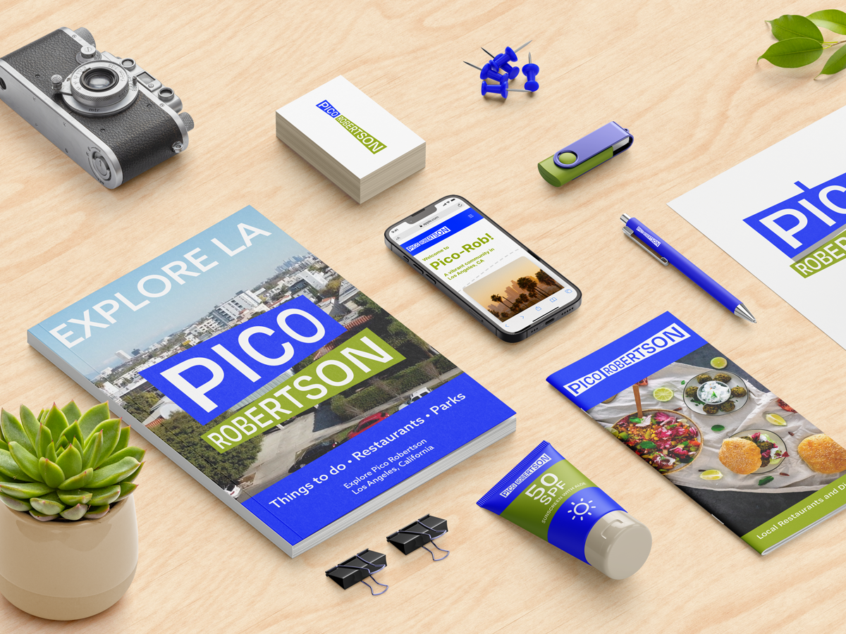
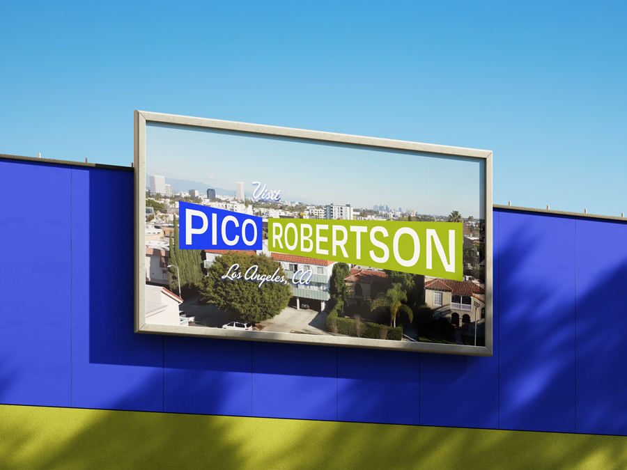
The project aimed to establish a distinctive brand identity for the community, including both a
community website and merchandising. It's aim is to establish the Pico-Robertson community and brand
while cultivating a recognizable image for the area. Just as West Hollywood or Santa Monica possess
their own distinct logos, this recognized the need for Pico-Robertson to have a brand that uniquely
represents its community.
Disciplines: Branding, Digital, Packaging
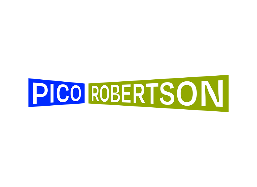
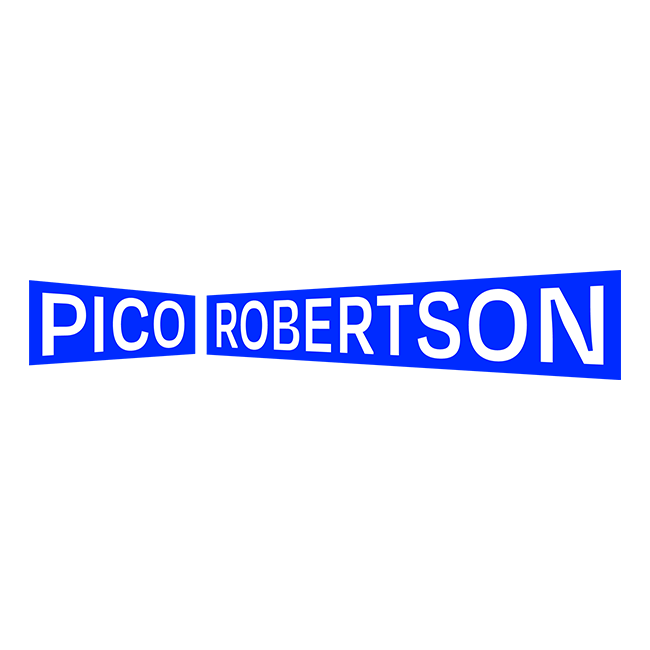
Horizontal Variations
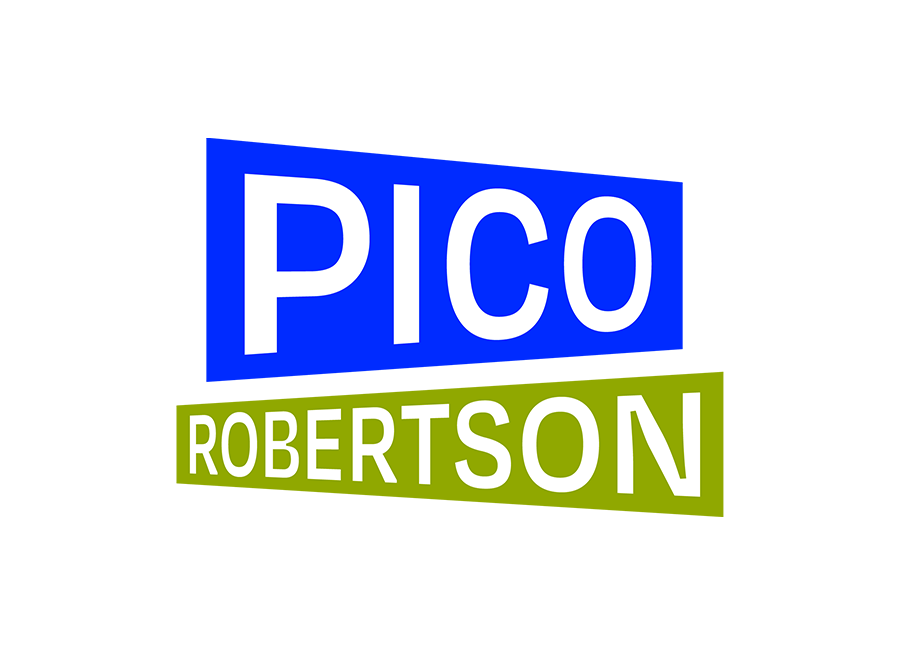
Stacked Variations
Inspiration
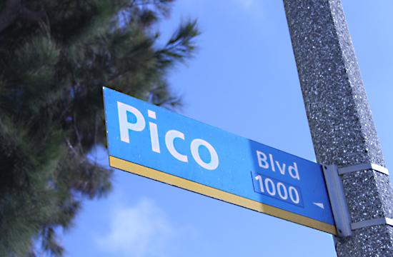
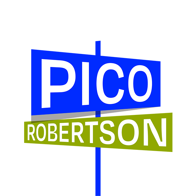
This project was inspired by the iconic bright blue street signs of Los Angeles.
I utilized a complimentary green color, as contrast and to associate itself with the iconic green highway sign color.
The signs meet, signifying the intersection of Pico and Robertson Boulevard.
The logo can also be stacked, for varying media formats, and also illustrates two signs intersecting on a single street pole.
