Libra
Libra empowers readers with a social platform to share personal libraries with like-minded individuals everywhere.
My Role
Product/UX Designer
Timeline
Winter 2019
Project Brief
Challenge
Found people are reading fewer books, spending their time instead with digital media, and other forms of online entertainment.
Solution
An app that would connect readers via a literary vehicle would be beneficial and popular to a subgroup of bookish people, bringing them together in both the digital and physical realms.
Background Research
Interviewed, researched, and identified potential target users.
Downloaded competitive apps and conducted user testing to target and isolate what seems to be
working and any lack of intuitive user experience.
Competitive Analysis
Who would be Libra’s competitors?
Discovered possible competitors to Libra. Doing so would allow me to better grasp the current market, and what features I can implement, modify or improve.
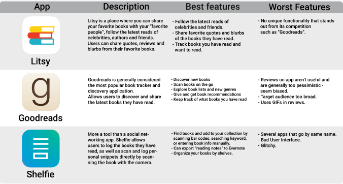
Isolated Libra’s three main competitors. Compared best + worst features.
Target Users
Who are Libra's target audience?
In my research for competitive apps and assessing the current market, I
have narrowed down demographics.
Libra targets users with a personal book collection who seek to share them with others. Obtain and
share book recommendations from real people, not algorithms or mass trends (i.e. Amazon best
sellers).
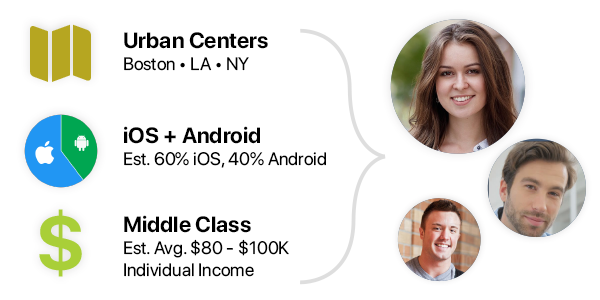
Demographics
- Cheery and social, fun and caring, motivated and committed.
- Estimated Average Income: $80K/year
- Ages 20-40 male/female.
- Live in urban, “tight-knit” cities.
- Medium to high knowledge of technology.
- Approx 60% use iPhone, 40% Android.
Based on user interviews + personally conducted research
Personas
Who might be a Libra user?
Organized numerous interviews with potential users. Identified commonalities and visualized a likely Libra user based off interviews + further research. Listed possible scenarios according to conceived “day in the life” of a user. Identified pain-points along journey.
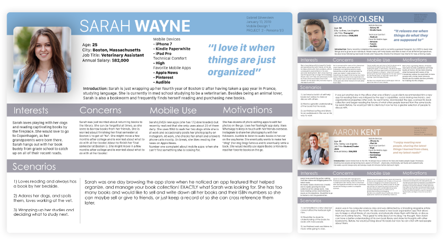
Created 3 mock persona's based off
interviews to identify 3 potential target users.
Used as foundation for design decisions.
Concept Development
Rough Sketches
Library Screen: Initial sketches for how one might interact with their book library.
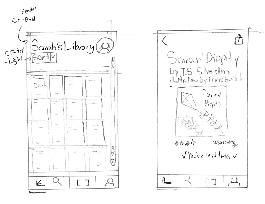
Left: Home Screen layout of
"Shelves" to house latest reads.
Right: User tapped on a book to see more
information.
User Flow
Identified four main menu screens in tab bar.
Focused on specific tasks and user goals and created possible user flows accordingly.
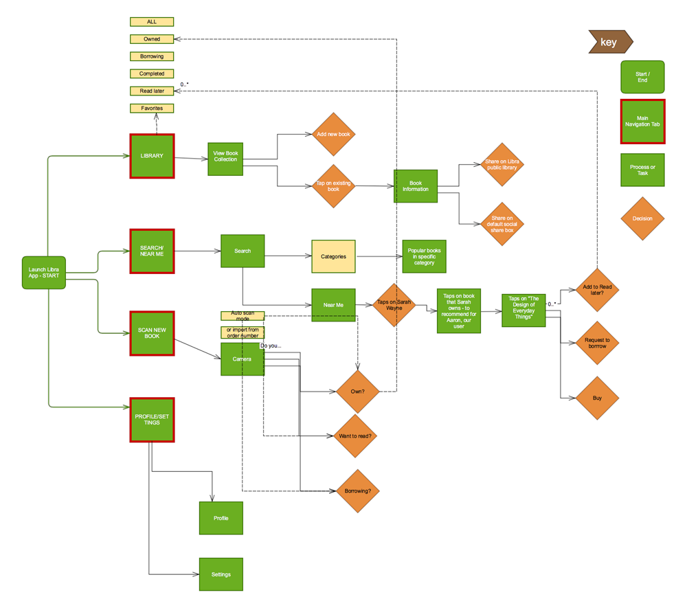
Created ‘screens’ along a user’s process in a
specific task
and identified key user decisions and
interactions.
Wireframes & Lo-Fi Prototyping
Developed wireframes based on research conducted and User Flow. Focused on identifying clear objectives (Tasks), and creating necessary screens and features (such as scanning a book, then adding to reading list).
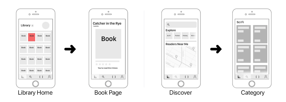
Designed two basic user flows that accomplish
two essential tasks:
Viewing more info on a book and Discovering a new read.
Visual Design + Typography
The Libra Logo color scheme strategically corresponds to the current orange Apple Books Icon.
Logo implements Humanistic “Gotham Rounded” type choice as Libra providing a more humanistic look
and feel in its visual design.
Libra means “Book” in Latin.
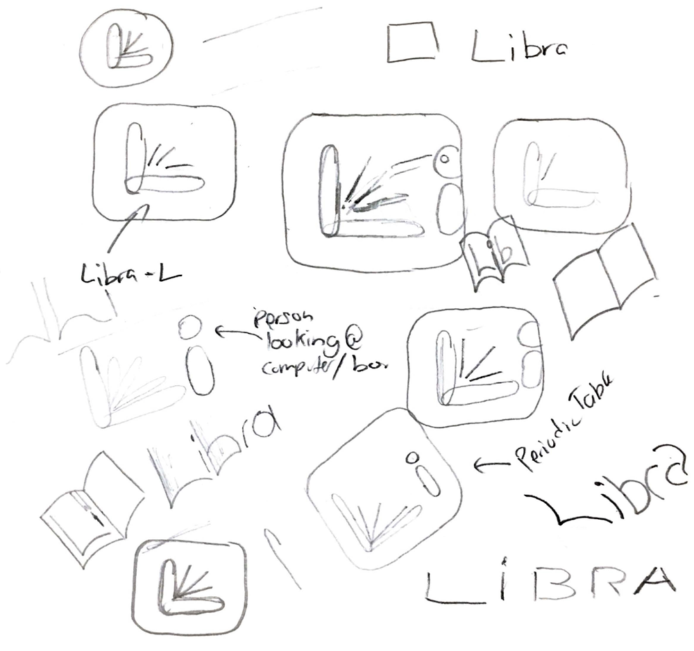
Logo: Libra logo is signified by the
letter L,
incorporating an open book
and
a laptop with a radiating light.
How to use Libra
Meet Sarah
• Loves to read but has difficulty finding time.
• Now uses Libra to keep track of her current reading list, what she has read, and what’s next.
• Stores digital record of book collection, as well as a way to explore recommendations from other Libra
users.
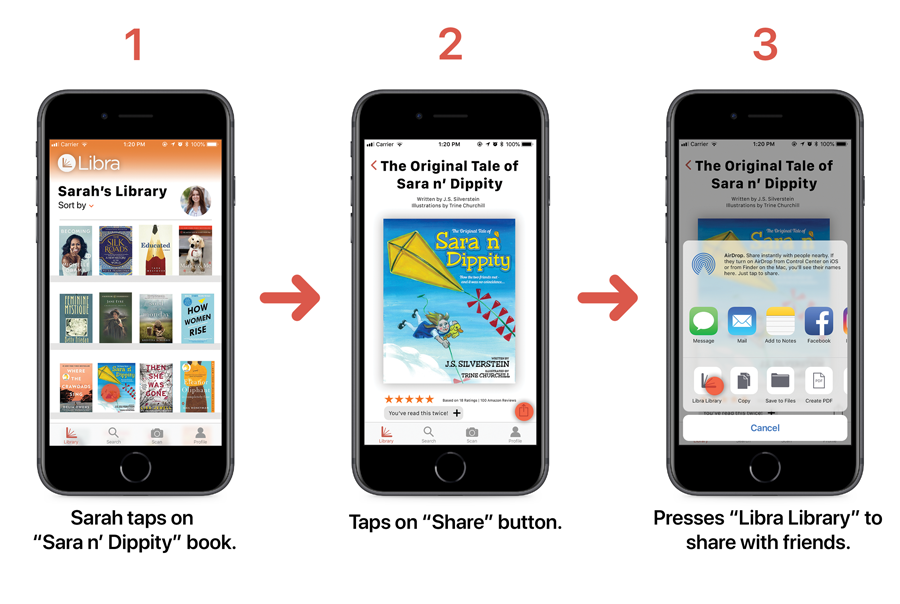
1. Sharing to Libra Library
Sarah wants to share a book from her library to the Libra Library, where others can physically request to
borrow the book, send to a fellow Libra reader, or share to a Libra book club group.
She scans “Sara n’ Dippity” and adds it to her Library, then shares it directly to her book club group
on Libra.
2. Scanning + Add to List
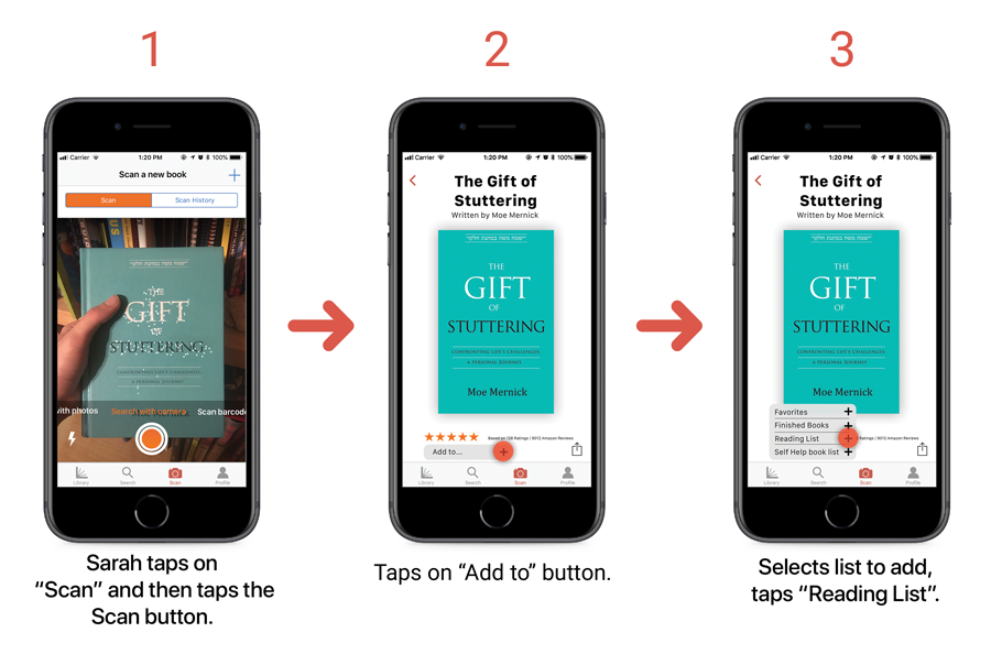
Sarah’s little brother has a stammer, and she just found an interesting book that might help him!
Uses the “Scan” feature to quickly scan the book and add it to her read-later list.
She can choose to scan from a previous Photo, with the Camera, or by Barcode. Libra scans for words,
pictures, or barcodes and then identifies that specific book.
Reflection
My personal experience of sharing my own library with friends sparked my vision
for Libra.
In this project, I further honed my prototyping and interaction design skillset and knowledge. I also
learned via Libra, how to tailor an application specifically for a particular demographic.
Libra logo, name, and all related designs are Copyright Gabe Silverstein
2020.
I am not affiliated with the books shown, with the exception of The Original Tale of Sara n' Dippity
